Sunday, July 30, 2017

Sketchbook Tips from Helen Oh
Sketchbook: Visual Journal Making is a course I teach at Chicago’s Palette and Chisel Academy. The course invites students to explore ways to take visual notes. We explore how to create quick, effective sketches for their own sake, or as preparatory work for other projects. We work on mark-making, both free and gestural and precisely detailed.

In the summer and fall, my class meets outdoors at different Chicago locations. As a colleague from England told me, “the residents of no other city that I know celebrate summer like Chicagoans.” After freezing through winter, my students are eager to explore city’s long stretches of waterfront, parks, landmark buildings, and lush gardens, including Millennium Park, Chicago Cultural Center, and Garfield Park Conservatory.

Essential Design Concepts
A good way to begin sketching is to study shapes and see how light renders them. Look for contrasts: juxtaposed geometric shapes of buildings, walkways, fountains against organic trees and people.

A view finder can be useful to frame a scene, from which one can make thumbnail sketches. First indicate contours, then add shading to indicate dark and light shapes. I recommend three to five values. In setting up the composition, consider grouping shapes together, in an asymmetric design, and setting a focal point apart from the larger supporting shapes. Look for way to incorporate repetition, to strengthen the theme.

Consider also adding people or other recognizable objects to indicate scale. Check the perspective—make sure the eye level is correct and depth lines (orthogonals) recede back to either one or two-point perspective as observed.

Using Color
It is not necessary to paint an entire sketchbook page. Think of the sketching as making color notes. The sketchbooks of British textile designer William Morris, and preparatory sketches by Christo & Jeanne-Claude, offer excellent examples

When using water media, I recommend that, after the contour lines are placed, areas are filled with color using Stabilo pencils. This water-soluble pencil brand can be brushed with a damp mop brush to produce colorful washes. Once dry, I further work in details with a small brush using watercolors and white gouache.

Materials 
I recommend limiting the art supplies to only those absolute necessary and easy to transport. Planning what you want achieve prior to each session helps in selecting materials, as well as achieving the goals you set for your outing.

Here are materials I suggest:

1. All-media sketchbook such as Moleskin watercolor album or Bristol pad
2. View Catcher https://www.amazon.com/Color-Wheel-Artists-View-Catcher/dp/B001DKMZNG
3. Graphite pencils, sharpener, eraser
4. Stabilo Marking Pencils (all-surface, available in black, blue, brown, green, orange, red, white) or other watercolor pencils
5. Brush with water reservoir or watercolor brushes. Examples: Niji waterbrush
6. Small container for water
7. Watercolor brushes flats (1⁄4", 1⁄2", 3⁄4") and round (#3 and #1) in nylon or sable
8. Folding plastic watercolor palette, 8"x 8" opened (Blick) or other brand
9. Watercolor tubes or cakes: Indian yellow, yellow ochre, alizarin crimson,
olive green, oxide of chromium, permanent magenta, ultramarine blue, ivory black
10. Designers Gouache tubes: Titanium white
11. Tripod Folding Stool (Amazon) or folding easel is optional.

Sketchbook Making
I also construct sketchbooks, pairing them in different themes. There are two techniques I use: a folding method, made from a single sheet—without using glue or staples, and a wire-bound method.

The folding method offers freedom to experiment with wide range of papers. I normally use Annigoni all-media paper made by Cartieri Magnani (beige) available at Legion paper. https://legionpaper.com/annigoni/

For the wire-bound books method, I cut paper sheets to same size and sketch and save them in a portfolio. Depending on the theme or subject, I collect a group and bind them at a local copy store.

Master Sketchbook Artists
Albrecht Dürer
Rembrandt
Raphel
Giovanna Garoni
William Turner
William Morris
Winslow Homer
Andrew Wyeth
Edward Hopper
David Hockney
Ellsworth Kelly
Christo & Jeanne-Claude

Upcoming Classes
I offer a five-session Sketchbook class at Millennium Park in the fall 2017. Please visit Palette and Chisel Academy website for more details
https://reg126.imperisoft.com/PaletteAndChisel/Search/Registration.aspx

Hope to see you there!

Helen

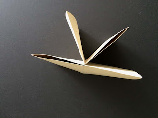
The sketchbook can be viewed as a book or as a single open sheet.
The open version produces abstract narrative. 

Wire bound sketchbook with clear plastic for the
front cover and black plastic for back.
I pasted on a red-bordered label for the title.
Various label are available on the web:
www.artfire.com, www.kencolabel.com

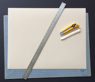
Sketching supplies
Various sketchbooks


Constructing folding sketchbook, step 1
Constructing folding sketchbook, step 2
Constructing folding sketchbook, step 3
Constructing folding sketchbook, step 4
Constructing folding sketchbook, step 5


Constructing folding sketchbook, step 6


Constructing folding sketchbook, step 7

Constructing folding sketchbook, result


Demo: Garfield Park Conservatory


Demo: 2-point perspective

Demo: 1-point perspective


Demo: Boeing Gallery, Millenium Park

Demo: Jay Pritzker Pavilion, Millenium Park
Demo: Cloud Gate, Millenium Park
Demo: Chicago Cultural Center


Demo: Botanical 1
Demo: Botanical 2

Demo: Opaque watercolor

Sketch by student Barbara Humbert

Sketch by student Sondra Pfeffer

Sketch by student Marcy Calkins


Sketch by student Lilly Lee

Sketch by student Maureen Shea

Sunday, April 23, 2017

Reflections on recent Going Dutch painting workshops in NYC and Chicago

My wife, Helen Oh, and I recently completed a Going Dutch oil painting workshop at the New York Academy of Art in TriBeCa. The workshop explores and implements an approach modeled on that of Flemish and Dutch figure painters of the 15-17th centuries. During two consecutive weekends, a group of talented and dedicated group of students put the course ideas to a practical test in painting the figure.

Soon thereafter, I taught the same workshop solo for three consecutive days at Chicago's Palette & Chisel Academy, with an equally interested and skilled group. 

Beginning with Jan van Eyck, painters of northern Europe mastered rendering the figure in linseed and walnut oils, then a new technology. They combined this novel medium with superb analytical skills applied in a systematically. Because of the objectivity of their approach, we believe it can be taught effectively. Examples of their ideas:

1. careful observation of nature reveals that light has color, e.g. north light is slightly blue and its shadow is faintly golden;
2. oil paint is effective in both opaque and transparent modes;
3. rendering in oil paint is best when applied in layers from dark to light;
4. dark transparent areas and light opaque areas visually correlate to the way we see things in terms of both color and form; i.e., under daylight, light on objects appear cool and solid, shadows on object appear warm and indistinct.
5. Color, form and space are related, and a painter can predict how the correlate based on information.

The value of the course is to share the achievement, in both process and aesthetics, of the Flemish and Dutch painters. They perfected painting the figure in oil, and created a systematic approach that captures the qualities of skin under natural light with great fidelity. Their way is truly 'oil painting as it was meant to be.'

What makes this approach so successful? First, its simplicity: natural light's cool color creates shadows that contrast by value and opposing warmth. Second, its systemic approach: These painters sought to preserve this dichotomy by beginning with a warm tone over a luminous white ground. The subsequent layers were intended to build cool light and form in illuminated areas, while keeping the shadows as thin, and warm, as possible. The transitional area between light and shadow—the half tone—was painted in a neutral color made by placing thick opaque paint over transparent warm color. This visual 'estuary' creates the illusion of form 'turning', (going around) so that the viewer believes it has weight, and an unseen opposite side. Third, this school of painters worked directly from observation, the traditional way figurative artists are trained, and one still valuable for building observational skills.

In both workshops, students worked under a cool light, much as the Flemish and Dutch painters did. Once a careful drawing on paper (sized to match the canvas) was made of the model, and a warm golden tone was placed over the canvas.  Students then attempted to discover the subtle alterations in temperature within both the lights and shadows prior to painting.  In this we were aided by the scholarship found in the book Art in the Making: Rembrandt by David Bomford, et al., (Yale University Press, 2006).

The drawing was transferred to canvas, and students began a three-layer painting.
Layer 1: Dead color with a limited palette of 4 colors: white, black, earth red and earth yellow. The aim was to lay in warm, transparent shadows, cool half tones, and slightly warm local lights.

Layer 2: the palette was expanded to include a greater range of hues, though primarily earth colors preferred by Flemish and Dutch figure painters like Jan Steen, De Gelder and Rembrandt. The shadows and halftones were reinforced, and the lights refined by painting more colorful local lights and finally, cool highlights.

Layer 3: Reflected lights carefully placed in the shadows and scumbles (opaque over transparent paint) and glazes (transparent over opaque paint) added to complete the painting.

Below are my demo images from both NYC and Chicago workshops, plus some examples of student work.


Drawing over panel. My demo in Chicago


Dead coloring. My demo in Chicago


After Second coloring. Chicago


Final. My demo in Chicago 20" x 13"


Detail


Drawing transferred to panel. My demo at NYAA


Dead coloring. My demo at NYAA


After Second coloring. My demo at NYAA


Student's completed work, Chicago


A student's complete painting at NYAA


Saturday, June 18, 2016

Acrylic 2.0

Among the many benefits of oil painting is the ability to add both transparent and opaque layers of wet pigments to produce a lush surface, varied in both texture and color. Until recently, Helen thought this approach was not possible in another painting medium. That is, until she took another look at acrylic paint.

Realist painters whose work we love, including David Hockney and the late Lennart Anderson, have used acrylic to spectacular and varied effect. Though, without directly knowledge of their working process, which bring out the naturally bright and light qualities of this medium, Helen knew this would be a challenge. She decided to try something different: to attempt to use the traditional oil painting process she has used and taught, in order to recreate the density and variety of surface as in her oil paintings. Here is how she did it.

First, she prepared a panel by coating both sides with acrylic gel medium. This keeps the humidity levels constant on both front and back of the paper surface.


Next, she applied a thin imprimatura on the front of the panel with a deep golden yellow, very like those in a typical Dutch oil painting. She did this since, as the Dutch did, she was working from a still life bathed in cool, north daylight, which tends to produce warmth in the shadows. As the painting layers pile up on the lights, the thinner shadows tend to reveal more of the imprimatura color, which helps maintain their warm glow.


Working directly from a still life setup, Helen sketched the motif in vine charcoal. She then squeezed out acrylic paint onto a Daler Rowney Stay Wet Palette®, which she likes because of its ease of use and clean up, and blocked-in the large shapes.  The charcoal was quickly absorbed into the paint allowing variation in edges between shapes, much as in oil painting.


Initial shapes were blocked-in differently, depending on value and temperature: for example, darks were mixed with acrylic medium and no white, conferring them a transparent depth, while the lights were thicker and enriched with white, covering the imprimatura and lending solidity to forms.


Where the acrylic really shines, is the ability to layer paint almost immediately. This meant that fresh flowers could be fully rendered by building up shadow to highlight within a single session, and fine details added without the risk of disturbing layers, as can happen in oils. Helen also opted for a palette that, like her oil colors, ranged from dark, transparent pigments to bright ones, and she created a ‘medium’ as in oil, by filling a small cup with a mix of acrylic gel medium and water, and adding this to the darks which were then layered over the block-in. This produced an effect similar to that achieved by glazing in oils, again, without any time delay.


Adding details in the colorful Blockitecture® pieces was also easier in acrylic. To maintain the crisp window details, Helen taped around them, masking off the walls, and filling in the windows with bright color. This type of masking is more difficult with an oil painting, since the surface often rejects the tape adhesive.


Detail showing taping process. The window color was painting between the masked areas.


Finally, additional coats of acrylic thinned in the medium completed the reflections and other highlights.


Background and details added. Completed work. Still Life with Blockitecture, 16 x 16 in., acrylic on panel.

❧ ❧ ❧


Helen also used a similar approach in acrylic to painting a figure on linen.


Portrait of Dancer, 28 x 20 in., acrylic on linen.


Detail of above work.

You can learn more about her approach at her upcoming workshop at Chicago's Palette & Chisel Academy of Fine Arts. The three-day workshop runs from August 16, 17 & 18. For more info, visit
http://www.paletteandchisel.org/

Thursday, April 28, 2016

August Sander's Dora

The work of German photographer August Sander has long fascinated me. One facet of his career was to document artists of his generation. Among these photos is a strange image of known as Hans Heinz Luttgen and his Wife Dora, taken in 1926. Here is the image from the National Gallery in London.


The juxtaposition of physical differences between the May/December pair is striking and the image provocative. The look of Dora, in particular, caught my eye, and apparently caught the eye of Sander, since he also photographed her posing without her husband.

I thought I might try to capture her likeness by painting from this photo reference, something I hesitate to do, since I prefer to work from life whenever possible. I find the information I need as a painter is often lacking in photo references, no matter how large or clear they are. In some cases, however, I have no choice, as in this one. So I began:

First, I simplify the image and crop out Hans in Photoshop.


Transfer a simplified outline to unstretched linen and reinforce in graphite pencil.


Setup with computer and painting


Block in darks and halftones


Complete the face. I decide to put her in a fencing jacket.


Set up jacket on a mannequin.


Paint the jacket.


Transfer her name (Dora Delfs—I used her maiden name, found on German Wikipedia). I did this because it turns out Luttgen divorced her before his move to New York City.


Final painting.


Painting in Frame.