Monday, October 27, 2014

Apple iMac Computers as Still Life Objects

My little collection of Apple computers has, over time, made appearances as still life objects in my paintings. I include many of them in this post. In fact, the computer's role in motion capture has become an important theme in my work in recent years. You can see examples here:

http://cargocollective.com/andrewsconklin/Motion-Capture-Studio-Paintings-Chicago

I find the early iMacs in particular beautifully designed, very paintable, and interesting in that they epitomize the computer graphics revolution of the last generation, a movement that coincided with Helen's and my education as visual artists. In our own training as draftsmen and painters in art school and college, the computer played only a tangential role, though, over time the powerful technology has proved of great assistance in planning and testing compositions. 

There is another side to their inclusion in my work, having to do with what I see as the 'rivalry' between the traditional reliance on my own eye and analog tools to make art, and the digital tools, that, while adding convenience, insert their own aesthetic into the process. For my part, I prefer to keep my process mostly free of electronic technology, working out paintings from live models and still life objects observed directly before me in the studio. Of course, as the technology becomes ever more impressive and useful, I anticipate its advantages will eventually overcome my resistance.

Square Still Life, Blue


Square Still Life, Yellow
Still Life with iBook, La Primula Bowls and CDs

Rebecca and Helen

Interior with Woman in Kimono

in Progress: Nude on Purple Divan

Nude with iMac


Interior with Venetian Chandelier and iMac

Detail of Interior

Sunday, August 17, 2014

Helen Oh — Oil Materials Class in Chicago


As an art student I attended several schools. At one of them, the National Academy of Design, in New York City, I recall a particularly fascinating course, titled Painting Materials, Methods and Techniques, taught by Dr. Furman Finck.


The first thing I learned from Dr. Finck was that the jars of ‘gesso’  I had been priming my panels with wasn’t gesso at all, but an acrylic substitute. The real gesso, he showed us, was a silky white gypsum powder, the best quality of which was imported from Europe. 
With patience and gentle encouragement, Dr. Finck taught my classmates and me how to prepare canvases and panels to paint on, and how to properly grind pigment powder to make oil paint. The lessons I learned peaked my interest in the nature of artist materials. Shortly thereafter, I became an apprentice to a framer, Timus Bowden, who ran a large studio in mid-Manhattan. There I assisted in restoring and gilding enormous Baroque frames and period Neoclassical furniture, among other things. 
My knowledge of gilding and framing eventually connected me to a position as a painting conservator, which became my profession for more than fourteen years. 
As a painter, I rely on these experiences, as a student, framer and conservator, to inform my approach to the materials and processes of oil painting. This experience, along with numerous visits to view master works throughout the US and Europe, has helped to me discover the best color palette, media, and supports to work on. For instance, I prefer to paint primarily with non-toxic earth colors. 
As a painting instructor, I formerly taught a semester-long Oil Painting Materials course at the School of the Art Institute of Chicago. This year I offered the course as three-day workshop at the Palette and Chisel Academy of Fine Arts in Chicago’s Gold Coast neighborhood. My students and I had a heady weekend stretching canvases, making paints and gilding with 22K gold leaf. The images are sample colors charts and my students working on projects. 

I am offering The Oil Materials Workshop at the Palette and Chisel   this fall. The dates and times: September 12,13,14 from 9 am—4 pm.  
If your are interested, please register by following this link:

http://www.paletteandchisel.org/org/PaletteChisel/cms.aspx

or call 312-642-4400

Testimonials:

"I thoroughly enjoyed Painting Materials Workshop. There are very few people that teach this. If somebody wants to learn how paintings and pigments are put together in the dutch painting tradition: This is the workshop to go to. It was fun, we learned about a lot of topics and met some very interesting people along the way. All the basics were discussed. Everything is usable. And some of the materials we used were simply amazing. What fun to learn painting in this way!!!"


"Helen Oh's weekend workshop on prepping surfaces for oil painting was excellent. From making rabbit skin glue, gilding a panel with gold to making color charts from pigment, the participants gained an enormous amount of knowledge about materials. We also had 'hands-on' experience preparing paper, linen canvas as well as panels for oil painting. Helen demonstrated how to make gesso, egg medium and oil paint from pigment. It's an opportunity to understand better as a painter the importance of having a well prepared support for your work. Helen shared historical techniques with the class that are still used today. I highly recommend this workshop."
—Sue A.

Friday, August 15, 2014

Plein Arizona, Part 1

This summer brought the promise of painting out-of-doors, and as it happens, the city this June, July, and the first half of August has been particularly amenable to the practice: consecutive days without the threat of rain, with moderate temperatures and gentle breezes.

Working at Coffee Pot Rock.
Unfortunately, my schedule has not permitted my time to indulge my interest in painting en plain air. So instead, I am posting a series of oil sketches on panel Helen and I painted several years ago in sunny Sedona, Arizona, during the mild winter and spring seasons.

We stayed in the residential area just south of Coffee Pot Rock, a dramatic burnt red-orange rock formation strikingly similar in shape to a traditional cast iron coffee pot. During our two trips there, courtesy of two generous friends who owned a charming home in the above mentioned neighborhood, we had an opportunity to paint at various spots along the lovely hiking trails, with their dramatic views of the colorful, sun-drenched landscapes. While nothing can compare to being their and hiking the paths in person, perhaps these photos of our sketches will inspire you to consider a visit.

I painted Coffee Pot Rock twice, on two separate days. Here are the progressive images from the second sketch. I worked on heavy illustration board, either Bainbridge or Strathmore, over which a coat of rabbit skin glue (into which was sprinkled some powdered umber) was applied. No additional ground was necessary, as the glue size over paper provides an excellent surface to which the oil will adhere.


The panel, toned with glue and pigment, with penciled outlines.

Patches of oil color applied to the panel.

More foreground and some background added, no blending yet.

Blending the wet paint to 'sculpt' the forms.

The finished work on location.

Completed Coffee Pot Rock 2 sketch completed.

Coffee Pot Rock 1 sketch, painted a few days earlier. This first attempt lacks the
steeper perspective of the second version, though it includes a bit more surface detail.


Sunday, May 18, 2014

Spring Flowers Painted from Life

For Helen and me, one of the most thrilling, challenging, and vital components of our training as representational painters is working from direct observation of our subject, whether it is a figure, still life, landscape, interior, or indeed, a combination of these. In fact, we enjoy combining aspects of all these subjects, as did our heroes the Baroque Dutch and Flemish oil painters. (I should mention here the works of the late American painters John Koch and Charles Pfahl, who also reveled in this approach to their subject pictures.)

I was thinking of one painting in particular last week, the Portinari Tritych (1476-79) by Hugo van der Goes, when, on a brief trip to get spring flowers for our tiny balcony garden, I spotted a beautiful columbine plant. I brought it home and immediately set it up in our studio so I could paint it that afternoon. My experience painting fresh flowers taught me that they behave like beautiful, but unruly, models, who continually change their poses as one works. They have a peculiar habit of continually opening and closing, not to mention rotating toward the sunlight. So, I knew time was of the essence in capturing their likenesses.

Van der Goes's painted columbine is a small, but striking element within his 8 foot high by 19 foot wide altarpiece. Painted on three wood panels, the middle image shows the Nativity scene with a small still life of flowers at the bottom center.


What makes this so memorable—Helen and I saw the work on a trip to Florence a number of years ago—is both its amazingly life-like quality, and the way the flowers echo the attitude of the Virgin Mary. The number of open blossoms (7) is itself a clue to the narrative of the work. According to A Handbook of Symbols in Christian Art, by Gertrude Grace Sill, the columbine


is a symbol of sorrow, because of its deep blue-purple color. A bunch of seven columbines refers to the Seven Sorrows of Mary. Its name come from a word meaning dovelike, because of its wing-shaped flower, and thuse it becomes a botanical emblem of the Holy Ghost.


The entire triptych can be seen here: Portinari Triptych


I then set to work. I took a sheet of heavy acid-free paper which I had previously sized twice with animal glue, so that the natural color of the paper was unchanged. The glue, besides being invisible, seals the paper beautifully and allows one to draw and paint on it easily. I taped the paper to a sheet of gatorboard and placed it on an easel beside the plant, so I could render the plant actual size.

I first made a quick, accurate drawing of the stems and flowers, first on tracing paper, planning to transfer the sketch, but realized that, since the blossoms would move, and I wanted to adjust the spacing of a few of the blossoms, because of some awkward overlapping, changed my mind and simply penciled in each flower directly on the sized paper just prior to painting it. This allowed me to begin painting right away and focus on each petal as I tried to keep up a brisk pace, well aware of the limited daylight and the plant's proclivity to drift.

Below are a series of snapshots I took as I worked.

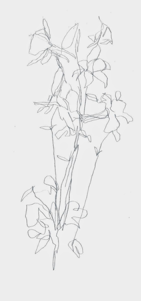
Pencil sketch on tracing paper


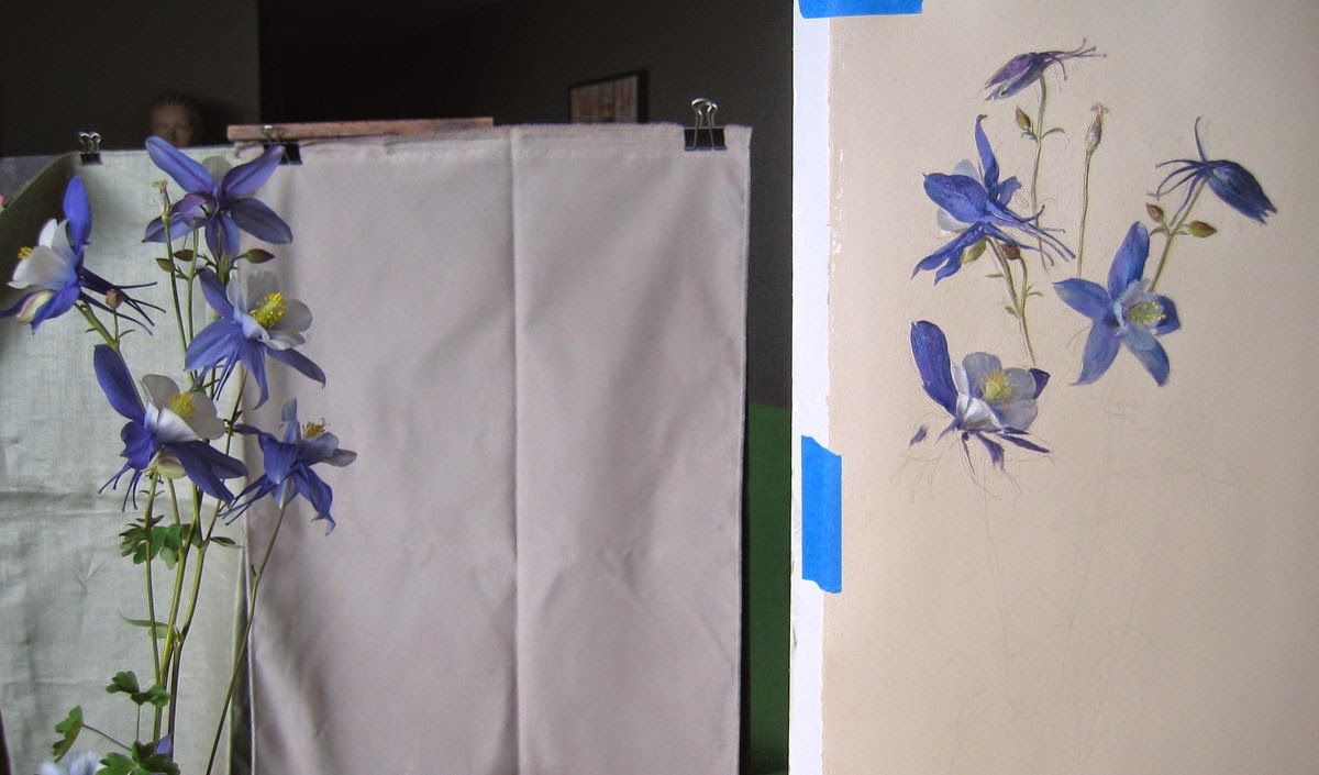
Oil sketch in progress


Helen reminded me that a group of seven would be a nice connection with the symbolism, so I tried to design the sketch as I went along, working from the top down, drawing, then painting as I went. After the first day, I completed five of the flowers. The following day I added the rest. so I had seven, plus an extra, dessicated blossom near the bottom (the color of a dying flower turns an intense Prussian blue which I found irresistible to attempt to capture).

Here is the final sketch:


Below are some details. I tried to apply my paint mixtures to the paper with a minimum of blending, in order to capture the delicacy and freshness of the flowers. I knew that I would have to sacrifice some form in this way, but felt it was worth it, given the time constraints.


After painting the columbine, I have a renewed respect for the work of van der Goes, whose image of this flower remains an inspiring memory. I hope one day to visit the altarpiece again, and view his masterful approach to painting this most elegant of spring flowers.

Tuesday, April 1, 2014

Alla Prima Portrait Demonstration

I recently taught a portrait workshop in Chicago, the subject of which was an alla prima approach. This method, popularized in the 19th century by painters such as Sargent, Sorolla, Zorn, Whistler and Boldini, relies on producing a strong, gestural effect with the brush, that, paradoxically, aims to capture optical effects: soft and sharp edged-focusing, accurate hue and value relationships and a sense of quick-looking, as if the subject was seen at a glance.

In my own work I prefer to layer the paint, building cool, opaque layers over warm, transparent ones, and the painting is preceded by a detailed contour drawing.

Nevertheless, it is enjoyable to test oneself by attempting to capture a portrait in a single, quick oil sketch, with little preliminary work.

For this demo, my view of our model was a right-facing profile. I used a 14" x 11" canvas board, which I earlier covered with a medium-value imprimatura of black & raw umber acrylic. Once dry, I began this oil sketch, which took about one hour, more or less.
Step 1: Sketching profile with charcoal

I quickly sketched out the model's profile in vine charcoal.  Her dreadlocks were pretty complex, and give the brief amount of time, I had to simplify them more than I wanted to.


Step 2: Laying in shadows and halftones
I mixed up a basic shadow hue (consisting of earth colors) for her skin, which is pale. The Palette and Chisel Academy, where the workshop took place, has excellent north skylights, so the light and temperature relationships were textbook: cool lights and warm, glowing shadows. So the shadow color, while dark, is warm. I also mixed and applied some halftone colors, which were more neutral, since technically halftones are cool, though this is somewhat contradicted by the warmth of the smaller facial features, where blood flows close to the skin surface, warming up the areas. I quickly placed the shadows and halftones on her hair.


Step 3: Adding lights
Once most of the halftones were applied—I worked quickly using flat synthetic brushes and a flexible Japanese painting knife—I mixed and began placing the lights. Again I attempted to identify the warmth in the lights, which follow the rule that lights are warm, while highlights are cool. This proved to be the case, since the skylights admitted cool daylight, giving the highlights a bluish-white appearance.


Step 4: Completed oil sketch

Here, with just a little time left, I focused on the individual features: I placed and refined the iris of the eye, the lights on the ear, and the details of the nose and mouth. I then briefly spent time on her neck and shoulders. The whole thing was a bit rushed, since I was also reviewing the students' work, but at least I got the features on the canvas at a reasonable level of finish.

Detail from flatbed scan


In this detail, a few things are visible: first, this alla prima sketch consists of a single layer, and in many places the imprimatura is visible between passages of thick paint. Second, the paint is applied with minimal brushing (or knife-blending), since in my view alla prima sketches look best with paint mixtures left as intact as possible. As a result, the transitional areas are not as smooth I as saw them, but the visual effects had to, for the sake of the medium, be subordinate to the properties of paint.


Sunday, February 16, 2014

Cool Reds, Warm Blues

Naturalistic painting relies on a number of essential concepts and processes. The concepts inform the way painters develop illusions such as form, space, texture, and so on. The processes govern the preferred approaches to selecting, mixing and layering paint, both in terms of longevity and to support the concepts listed above. Granted, there are, in the art of painting, as in any art, exceptions to any 'rules', but using the concepts and processes, plus a dash of experimentation, can assure satisfying results.

I have attempted to illustrate one such concept, the effective linking of a cool light source with oil paint's inherent opaque lights and transparent shadows. And to refer to the blog title, I have selected red and blue objects that I hope demonstrate this.

The still life consists of several red and blue plastic objects placed in my studio under cool daylight. I first drew from the setup on several sheets of tracing paper over plexiglass to refine the proportions.  This was done quickly, since I wanted to focus on painting.


I transferred the drawing to a panel prepared with rabbit skin glue, using blue Saral transfer paper.


Then, on to the painting. On my palette I laid out Winsor & Newton Foundations white, Mars black, raw umber, transparent yellow oxide, Mars violet deep, alizarin crimson, Winsor red, cobalt and ultramarine blue.


Beginning with the shadows, I applied the paint to the panel in an alla prima approach, using knife at first, then switching between knife and brush.


The aim was to use the natural luminosity of the white panel to make the shadows 'glow' and relying on the transparency of the pigments to replicate the optical 'warmth' i.e., the lack of opacity in the actual shadows. Some of this comes through in the photos, but unfortunately, since I'm not much of a photographer, some of the depth and warmth is not visible.

With the shadows applied, I moved to the halftones, the 'boundary' areas between light and shadow, where I began to add white to the mixtures, thus thickening and cooling them, just as the forms appear in nature.

I placed thick highlights after applying 'local' color to the areas just around the highlights, and finally added the gray background.


So, I attempted to show how a warm object, such as the red ball, can be 'cool', and a cool object, the blue dishwashing man, can be 'warm' at least in the shadows. I hope some of this effect is visible in these photos.


When thinking about this project, I recalled that almost daily I see a similar use of cool lights/warm shadows on my computer: the icon for the Apple's Safari browser. Here is a simple schematic of the color temperature distribution, inspired by that icon, which I hopes further illustrate how a single color can be altered warm and cool by the application of light.


Saturday, January 11, 2014

For contemporary painting enthusiasts

oil painting, oil paint, figurative, painting, western painting, european, art, drawing, figures, traditional art, traditional figure painting, traditional figurative painting, academic art, academic painting, Venetian, Venice, Dutch, Belgian, nude, female nudes, figures, canvas, linen, linseed oil, flax, pigments, brushes, artwork, Conklin, Andrew Conklin, Andrew S. Conklin, New York, Chicago, USA

Welcome to this blog. It is the aim of the writers, Andrew S. Conklin and Helen Oh, to introduce our art work to you, and to share something of our working process, and behind that, the ideas that initiate the sequence of events that result in a complete work of painting, drawing, or occasionally other things. 

A brief explanation of the blog's title: We trained as painters in the traditional mold, drawing and painting the figure model under the guidance of some great teachers. Among the important lessons an art student learns when observing and mixing color under natural light is that a skylight or north-facing window, the preferred light source for artists, emits a cool hue, so that under this light even warm objects, like the human figure, are suffused with cool color notes. Conversely, the absence of this light, through a complex visual process, leaves the shadows warm, with the result than even a blue object can appear warm where it is dark.

You can see more of our work at the following sites:


We hope you find this blog useful, engaging, and inspiring!